Learn
Elements of Design
Whether you are a costume designer or a set designer, there is a certain approach that has to be taken to create a design. Once a director has given the designer the production concepta written statement of a director's vision to unify the design of a play for the show, the designer must apply what they know about the design process to the task at hand. A designer must have a good understanding of the elements of design.
The elements of design are items that are the basis of all design (including outside the world of theatre) and are the components of everything we see. They are a starting point for all designs! Without these items, it would be impossible for a designer to create anything that an audience sees on stage.
Five Elements of Design
The five elements of design that designers must consider are
- shape,
- line,
- color,
- texture, and
- space.
Once a designer masters the elements of design, he or she is able to create costumes and sets that meet the needs of the director and satisfy the wants of the audience. A strong understanding of the Elements of Design create designs that speak without saying a word! With this in mind, explore the five elements of design below.
Line
A line is a linear path made by a moving point that can vary in width, direction, and length. A line can be created by an instrument on a page like a brush, pencil, pen, or mouse, or it can be created by the meeting of two shapes. In scenic design, "line" could refer to the contour of a set, an onstage structure against the cyclorama (a panoramic backdrop), or the linear effects of scenic painting.
Lines have direction, like vertical Lines that go straight up and down and do not slant , horizontal Lines that go left to right or right to left and do not slant , oblique or diagonal lines that slant , and curved bends in a smooth, continuous way without sharp angles . Their direction can evoke emotion in a viewer. For example, oblique lines and zigzags may connote action, danger, and/or suddenness; thick vertical lines could convey strength, rigidity, and power; thin horizontal lines might indicate peacefulness and restfulness or perhaps delicacy and fragility; etc.
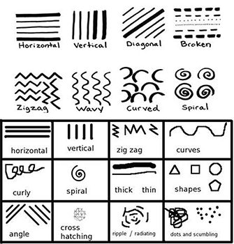
Different types of lines
Lines can help create distance in a set, or lines can draw the eye to a specific area on stage. They could also guide the eye around the set, indicating a flow of movement or the continuation of a landscape. Lines used together create the next element of design: shape.
Shape
A shape is a self-contained area with defined form. A shape can be defined by lines to create an outline of the form; it can also be defined by color. Recognizable shapes are called geometric or organic. Shapes that are difficult to identify are called abstract.
- Geometric shapes like circles, rectangles, and triangles are precise shapes that can be described using mathematical formulas. These shapes are frequently used to provide an organized quality to a design.
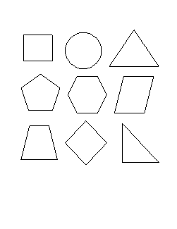
Geometric shapes have a definite edge. - Organic shapes or free form shapes are non uniform or irregular. They lack consistent edges and are more associated with objects in nature such as clouds, leaves, amoebas, and flowers.
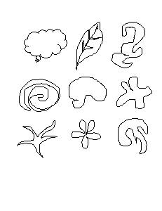
Organic shapes have no definite edge.
Shapes can be positive or negative. A colored shape on a white background is a positive shape and it creates a negative shape in the background! Look at this example:
- A positive shape is the one formed by the object itself.
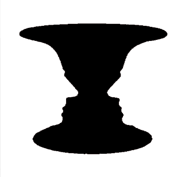
Positive - The one formed by the space around the object is the negative shape.
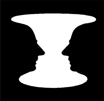
Negative - The combination of positive and negative shapes gives people the image of what they see.
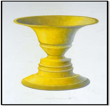
Image of a vase
Shapes come in all sizes, and the size of an object may connote significance or insignificance, strength or weakness. Look at how the shape and size of the ghost of Christmas Future from A Christmas Carol compare to the rest of the set. The set is full of smaller, geometric shapes (the bedframe, the fireplace) compared to the huge, flowing shape of the ghost.
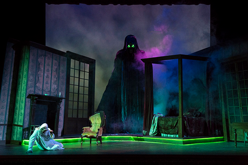
Image is used with permission of Theatre Tuscaloosa.
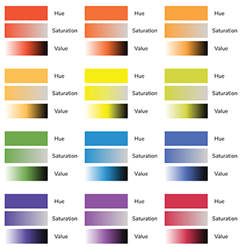
Color
Color is the hue, value, and intensity of an object as seen by the human eye. It's pretty amazing that we can see all different colors our brains are able to interpret how light is reflected around us!
Color originates from a light source (direct or reflected), and daylight (or white light) contains light waves for the full light spectrum (meaning all the colors). There is no color without light! The absence of light is complete darkness or black. The mixture of all visible light is white light.
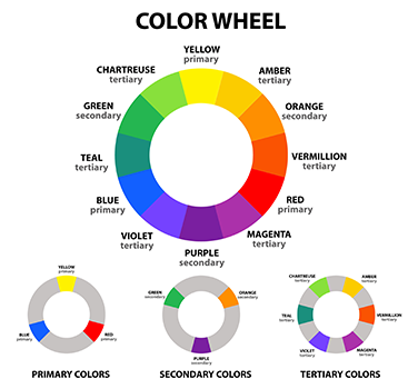
There are some components of color, including:
- Hue: Hue is the name of a pure color, such as red, blue, or yellow.
- Value: Value is the lightness or darkness of a hue (aka a color) and is affected by adding black or white.
- Light values of colors are called tints.
- Darker values of colors are called shades.
- The more light, the higher the value. White is the highest or lightest value. On the other hand, black is the lowest or darkest value. Colors have value as well. Yellow for example has a relatively high (light) value, while violet has a relatively low value (dark).
- Intensity: Intensity, or saturation, is the brightness or dullness of a hue.
- Pure hues are high-intensity colors.
- Dull hues are low-intensity colors.
- Intensity of color is changed by adding varying amounts of its complimentary color. For example, to make a bright green duller a little bit of red could be added to it.
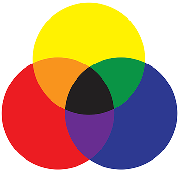
Creating colors with paint (for sets and backdrops) or with lights (to cast a color over the stage) requires different mixtures of colors.
- Light is additive, meaning it works towards white. The mixture of light is a combination of red, blue and green light in different proportion. All colors together will form white light.

- Paint or pigment is subtractive, meaning it works towards black. As with light, you can combine different hues of pigments together to form other colors. However, if you mix all colors together, you'll get black.
Color may connote emotion (excitement, rage, peace) and stimulate brain activity (action, relaxation, concentration). Here are some connotations of colors and how they may influence human perception:
- Red = Assertion, courage, determination, energy, excitement, passion, desire, strength, leadership, vigor
- Orange = Success, creativity, warmth, health, happiness, fun, determination, freedom, compassion
- Yellow = Hope, positivity, optimism, intellect, clarity, happiness, freshness
- Green = Growth, freshness, harmony, safety, ambitiousness, relaxation
- Blue = Trust, loyalty, sincerity, confidence, stability, faith, intelligence, tranquility, calmness
- Purple = Luxury, extravagance, power, ambition, wealth, wisdom, peace, independence, mysteriousness
- Pink = Affection, harmony, inner peace, approachability, charming, romantic, tenderness, acceptance, contentment
- Black = Power, mysteriousness, authority, sophistication, elegance, formality, strength, seriousness, void, darkness, evil, sadness, suppression, death, mystery
- Brown = Dependability, trustworthiness, simplicity, common sense, earthy, nature, boring, disappointment, depression
- White = Cleanliness, sterile, simplicity, innocence, honesty, peace, purity
Texture
Texture is the actual or perceived roughness or smoothness of a surface. It can be felt (tactile), seen (visual), or both. Basically, it's the way a surface looks or feels. Everything has some sort of texture, like smooth, fuzzy, silky, shiny, rough, bumpy, grainy, etc. Texture may be used to:
- create visual interest or a focal point in a work
- to create contrast within a design
- to help visually balance a design composition
Real or actual texture can be physically touched and felt. The item feels like it appears. For example, think of a tree branch. It might look bumpy and grainy, and if you were to touch it, it would feel rough.
On the other hand, visual or implied texture is created by using the different elements of art such as line, shading, and color to give the illusion of how an object would feel if it could be physically touched. Implied texture is two-dimensional and simulated so that the texture looks like its real. Think back to the tree branch. If you wanted to include a tree in your set design, getting a real, live tree on stage would be difficult! However, you could create a tree out of different materials and use your knowledge of lines, color, value, shape, and space to create something that looks like a tree to the audience.
Look at the set for the Molière play Tartuffe which is set in 1660s aristocratic France. The set designer used implied texture to make the columns and doors look like they are made of stone with ornate gold filigree when they are actually made a flat cardboard.
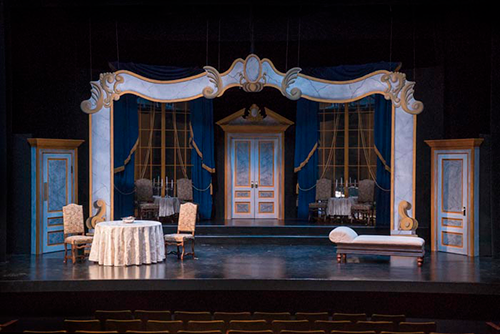
© 2015, UA Theatre and Dance. Image used with permission.
Space
Space is the area between, around, above, below, or within objects. It can also mean the dimensions of length, width, and depth of an object. Theatre staging involves both two-dimensional and three-dimensional objects and knowing how to create the illusion of space with 2D objects can really make a set come alive!
Here are some ways that shapes can be used to create the illusion of space on a stage.
- Size: Larger objects appear closer to the audience, while smaller shapes can appear further away
- Overlap : Partially covering one shape with another object makes the one in front appear closer
- Placement: Where a shape or object is located in relationship to the horizon line creates depth. Things closer to the horizon line appear further away, while objects closer to the audience at the front of the stage appear closer
- Atmospheric perspective: As objects recede into the distance, they begin to lose color, brightness, and detail
- Shading: Adding light and shadow to the surface of objects to mimic the way real objects would appear under the same lighting
Take a look at this photo. What do you notice about the size, color, detail, brightness, and placement of the shapes (the ground, the trees, the mountains)?
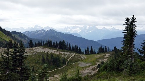
If you were drawing a set backdrop to create a similar mountain scene, you could create the illusion of space by making some trees larger to denote closeness to the audience and drawing some trees higher on the backdrop, smaller, and with less detail to indicate distance. You could also paint the mountains in varying shades of brightness, detail, and size as you move up the backdrop, again to create the illusion of space.
Here's a real-life example of how shapes were used to create the illusion of space on a stage.
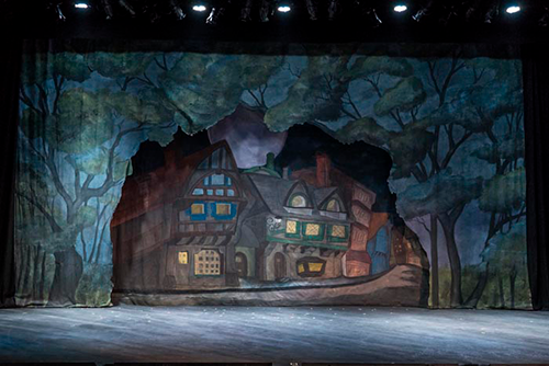
What do you notice about the size, overlapping, placement, and atmospheric perspective of this set for a production of Young Frankenstein? © 2015, UA Theatre and Dance. Image used with permission.